
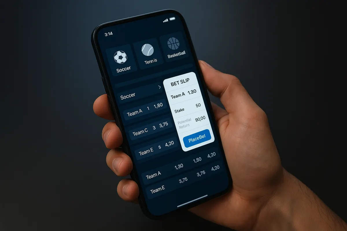
The myth that quietly wrecks mobile sportsbooks
A responsive site is not a mobile sportsbook. That is the myth worth killing first, because it explains most of the bad mobile betting products on the market. Good mobile sportsbook design is not a desktop layout that shrinks politely on a phone screen. It is a different information architecture built for one thumb, a vertical screen, an impatient user, and a connection that sometimes drops in the middle of a second half.
SOFTSWISS Sportsbook’s redesigned mobile layout is a useful case study precisely because it does not add features. It removes interactions. Fewer scrolls, fewer taps, fewer repeated filter adjustments. That tells you where the real problem sits in mobile betting layout work: not missing functionality, but friction stacked between a player’s intent and a placed bet.
What SOFTSWISS actually changed
SOFTSWISS Sportsbook released a redesigned mobile layout aimed at making it faster for players to discover betting content, navigate events and markets, and build bets on a phone. The update was demonstrated at SBC Summit Lisbon, and operators can switch it on through the CMS rather than through a development cycle.
The redesign targets three specific friction points. Each one maps to a design principle that applies well beyond this provider.
| Friction point | What SOFTSWISS changed | Transferable principle |
|---|---|---|
| Endless vertical scrolling | Dynamic horizontal carousels for Live, Prematch and Top Leagues | Use horizontal space to compress depth; put popular content above the fold |
| Repetitive filtering | Unified filtering, where a filter applied to a league or event updates all relevant sections at once | One input, global effect. Never make a user repeat the same decision |
| Slow bet building | A “Show top markets” view that surfaces popular markets in one place | Shorten the path to the markets most players actually bet on, especially for accumulators |
The operator-side detail matters as much as the player-side one. The layout is configurable in the CMS, sections and carousel content can be adjusted, and an operator can revert to the previous version without integration downtime. Alexander Kamenetskyi, Head of Operations at SOFTSWISS Sportsbook, framed the commercial logic plainly: mobile is where operators convert traffic into GGR, so reducing friction across the betting journey is a commercial focus, not a cosmetic one.
Why the phone layout now carries the whole business
Mobile betting is projected to account for 58.3% of the global online sports betting market in 2026, according to Coherent Market Insights. The operator-level numbers SOFTSWISS reports are starker: across its sportsbook operators, mobile devices generate 94% of GGR and 89% of turnover.
Read those two figures together and you get something interesting. Mobile produces a higher share of gross gaming revenue than of turnover, which is consistent with mobile being the channel for frequent, in-play, lower-stake betting rather than the channel for large pre-match stakes. That behavioural difference should drive the design.
How phone behaviour differs from desktop
Desktop bettors sit down. They compare prices across tabs, read form, build a multi-leg bet slowly. Phone bettors are doing something else at the same time: watching the match, commuting, half-listening to a commentary feed. Sessions are short and interrupted. In-play odds move while the user is deciding.
That has concrete consequences. A market list that requires four taps to reach is fine on desktop and fatal in the 40 seconds between a corner and a goal. A bet slip that silently expires a selection because the price moved costs you the bet and the trust.
What poor mobile UX costs
The cost is rarely a dramatic crash. It is leakage. Users abandon at the registration form because it was built for a keyboard. They abandon at deposit because the payment sheet is not touch-sized. They abandon at the bet slip because the confirmation state is ambiguous and they are not sure whether the bet landed. None of these show up as a bug report. They show up as a conversion rate that nobody can explain.
The elements that actually define effective mobile sportsbook design
Speed, because odds are time-sensitive
Load speed is the first UX feature, not a technical afterthought. Every extra second before interactivity is a second in which a mobile user can switch apps, and on in-play markets it is a second in which the price can change. Slow interfaces generate a specific, measurable problem: a higher rate of rejected or re-quoted bets, because the user’s tap arrives after the market has moved.
Practical priorities for mobile performance:
- Render the event list and top markets first; defer carousels, banners and promo modules.
- Stream odds updates over a persistent connection rather than re-fetching whole pages.
- Budget your assets. Marketing carousels and video headers are the usual culprits on a 4G connection.
- Test on a mid-range Android device on a throttled network, not on the newest iPhone over office Wi-Fi.
Touch-optimised interface design
Thumbs are imprecise. Apple’s interface guidance has long recommended a minimum touch target of roughly 44pt, and Google’s Material Design uses 48dp. Odds buttons packed tightly into a dense market grid routinely breach both, which produces mis-taps on the one element where a mis-tap means a wrong selection.
Three rules hold up well in practice. Put primary actions in the lower third of the screen, where a thumb reaches without a grip change. Keep spacing between adjacent odds buttons generous enough that a mis-tap is unlikely. And give every tap immediate visual feedback, because on a laggy connection the user will otherwise tap twice.
Navigation that respects a vertical screen
The navigation patterns that work on mobile sportsbooks are the ones that cut depth. A persistent bottom tab bar for the main sections. Horizontal carousels for sports, live events and top leagues, so popular content sits on one screen instead of three scrolls down. Sticky filters that persist as the user moves between sections, which is exactly what SOFTSWISS’s unified filtering does. Collapsible market groups, with the most-bet markets expanded by default.
What does not work: hamburger menus as the primary route into content, deep category trees copied from the desktop sitemap, and modal overlays that hide the bet slip.
Bet slip UX is where the product is won or lost
Everything upstream exists to deliver a user to the bet slip. If that flow is unclear, the rest is decoration. Three things define good bet slip UX.
Access and placement
The slip should be reachable from anywhere in one tap, with a visible badge showing selection count and potential return. A docked summary bar at the bottom of the screen, expandable into the full slip, outperforms a separate page because it keeps the user inside the browsing flow while they build an accumulator. Stake entry needs a numeric keypad and quick-stake chips, not a generic text field.
A confirmation process with no ambiguity
The user must know three things without reading carefully: what was accepted, at what price, and what the potential return is. That means an explicit success state rather than a slip that simply empties, the final accepted odds shown clearly, and a direct link into the open bets list. Where a price has moved, say so and ask for a decision instead of accepting a different bet on the player’s behalf.
Error prevention and recovery
Prevention first: disable conflicting selections rather than rejecting them after submission, cap stakes against the real balance and market limits before the user taps, and flag an unavailable market the moment it suspends. Then make recovery painless. Preserve the slip if a connection drops, let users edit a stake or remove a leg without rebuilding the whole bet, and make “undo” easier to find than “clear all”. A slip that wipes itself on a failed submission is the single most reliable way to lose a returning user.
Mobile-first versus responsive adaptation
These are not the same discipline, and conflating them is how responsive casino design ends up feeling like a compromise on both screens.
| Responsive adaptation | Mobile-first betting design | |
|---|---|---|
| Starting point | Desktop layout, reflowed down | Phone screen and thumb reach |
| Content decisions | Hide or stack what does not fit | Decide what earns the first screen, then add for larger displays |
| Typical result | Deep menus, cramped odds buttons, long scrolls | Shallow navigation, compressed depth, docked bet slip |
| Performance | Desktop asset weight carried onto 4G | Asset budget set by the mobile constraint |
The SOFTSWISS update is a mobile-first exercise in one clear sense: the changes are about reducing interaction count on a small screen, not about fitting more desktop content in. Carousels, unified filters and a top-markets view only make sense as solutions to mobile constraints.
What operators should prioritise
If you are rebuilding or auditing a mobile betting layout, the order of work matters more than the feature list:
- Measure the funnel by step. Registration, deposit, selection, bet slip, confirmation. Fix the biggest drop-off before redesigning anything aesthetic.
- Set a performance budget and test on mid-range devices over throttled mobile data.
- Audit touch targets across the odds grid against the 44pt/48dp guidance.
- Rebuild the bet slip first. Docked access, unambiguous confirmation, state preserved through connection loss.
- Cut navigation depth. Count taps from home to a placed in-play bet; treat anything above three as a defect.
- Keep layout control in the CMS so merchandising changes and rollbacks do not need a release, as SOFTSWISS does with activation, configuration and reverting without integration downtime.
- Make responsible gambling tools as easy to reach as the bet slip. Deposit limits, loss limits, session reminders and self-exclusion should be two taps away, not buried in account settings.
That last point is both a compliance expectation and a design test. If a player can find a market in two taps but needs six to set a deposit limit, the interface is telling them something you probably did not intend. Betting should stay entertainment, and the interface is where that framing either holds or quietly breaks.
FAQ
What makes good mobile sportsbook design?
Fast first render, touch targets that match platform guidance, shallow navigation that reaches a bet in two or three taps, and a bet slip that is always one tap away with an unambiguous confirmation state. Everything else is secondary.
How do you design a mobile betting interface?
Start from the phone screen rather than the desktop layout. Decide what earns the first screen, compress depth with horizontal carousels and persistent filters, place primary actions within thumb reach, and set an asset budget based on a mid-range device on mobile data.
Why does mobile sportsbook UX matter commercially?
Because mobile is where the volume is. Mobile betting is projected at 58.3% of the global online sports betting market in 2026, and across SOFTSWISS Sportsbook operators mobile devices account for 94% of GGR and 89% of turnover.
What is bet slip optimisation?
Reducing the friction and uncertainty between selecting odds and confirming a bet: one-tap access, quick stake entry, pre-submission validation of stake limits and conflicting selections, clear accepted-price confirmation, and slip state that survives a dropped connection.
Where can I see the SOFTSWISS mobile layout?
Details are published on the SOFTSWISS Sportsbook site, and the redesigned layout was demonstrated at SBC Summit Lisbon.
If betting stops feeling like entertainment, use the deposit, loss and session limits your operator provides, or the self-exclusion tools. Support services for gambling harm are available in most jurisdictions.